Iron Mountain Fitness – Brand Identity & Campaign
Iron Mountain Fitness approached us for a full brand refresh that would better reflect who they are: young, energetic, and relentlessly driven. The goal was to create a bold identity that captured both strength and momentum while standing out in a competitive fitness market.
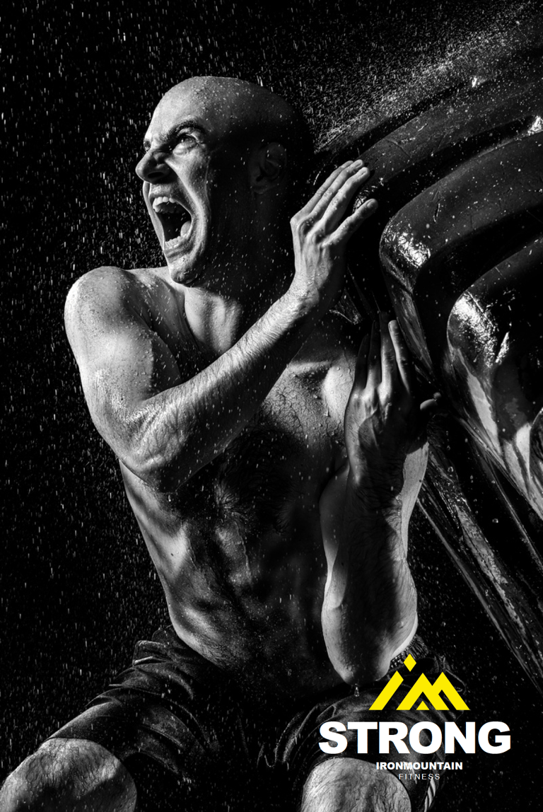
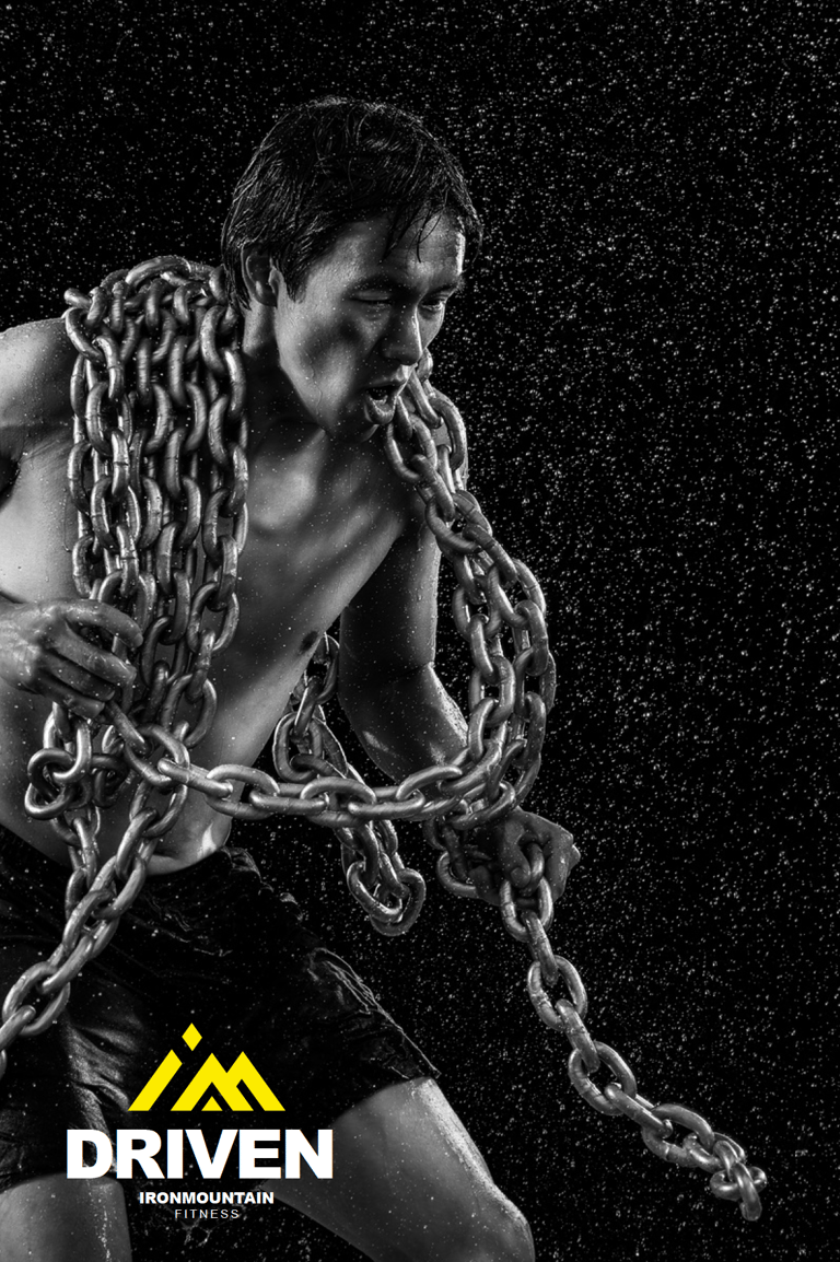
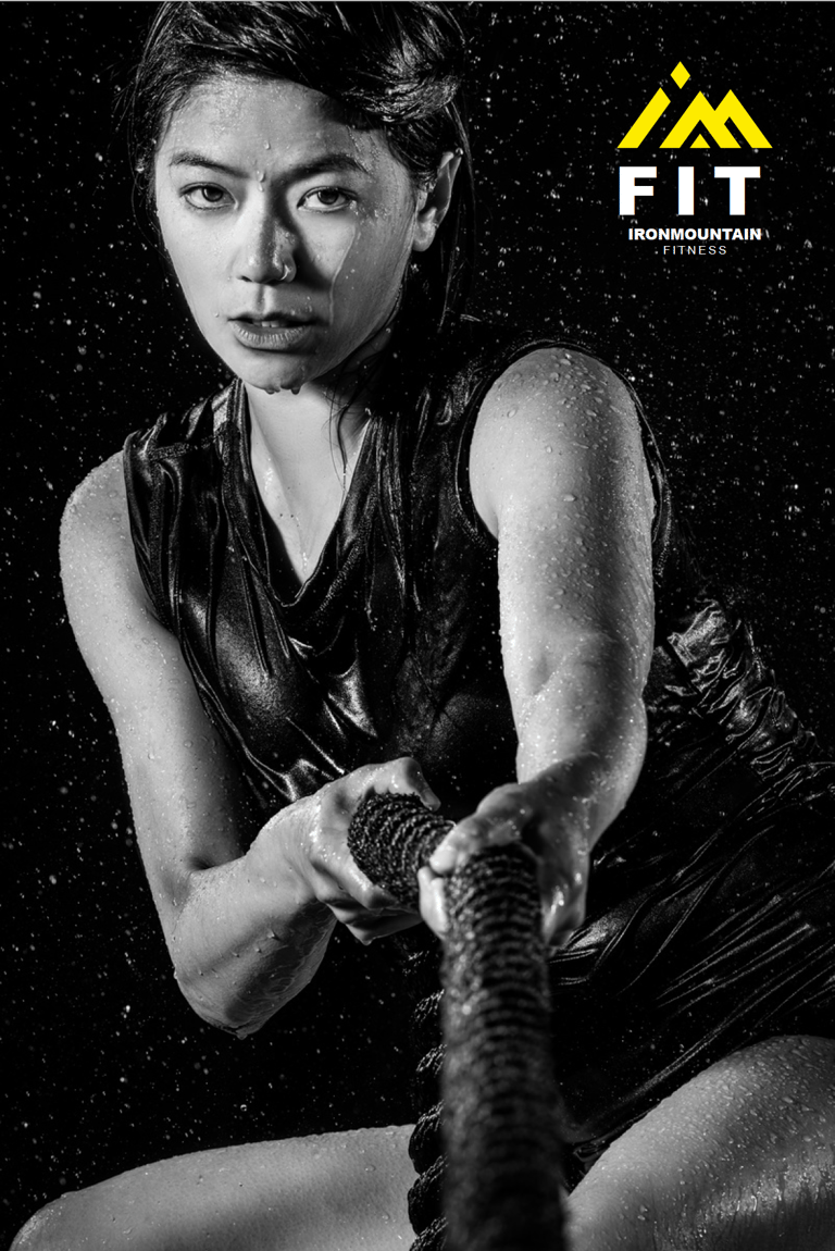
The resulting logo features the letters I and M forming the silhouette of a mountain, symbolizing endurance, growth, and pushing beyond limits. The vibrant yellow mark radiates energy and confidence, while its dynamic angles create a sense of movement and power.
For the campaign, the logo was positioned against a deep black background, amplifying contrast and impact. The IM mark cleverly doubles as the word “I’m,” leading into an inspirational message system: Driven. Strong. Fit.
The result is a bold and motivational identity that reflects the spirit of Iron Mountain Fitness—powerful, modern, and built to inspire.