Hookafina Branding & Packaging
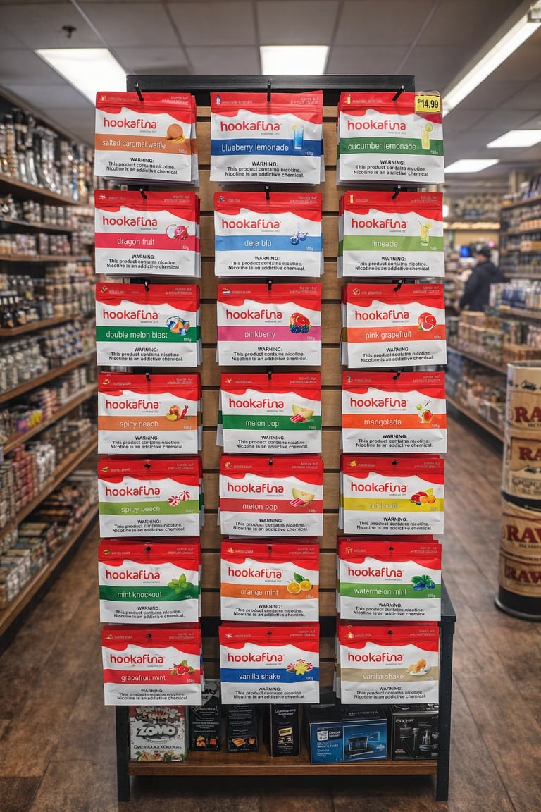
Hookafina’s brand identity was designed to be bold, energetic, and impossible to ignore. In a crowded market filled with dark, traditional packaging, Hookafina took a different approach—embracing a vibrant red color palette that immediately captured attention and created a strong visual signature across every product.
The packaging was developed with a sleek, modern aesthetic that balances simplicity with impact. Clean typography, bright flavor cues, and a consistent layout allow each flavor to stand out while maintaining a unified brand system. The result is packaging that feels contemporary, approachable, and instantly recognizable on shelves.
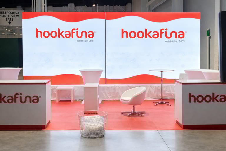
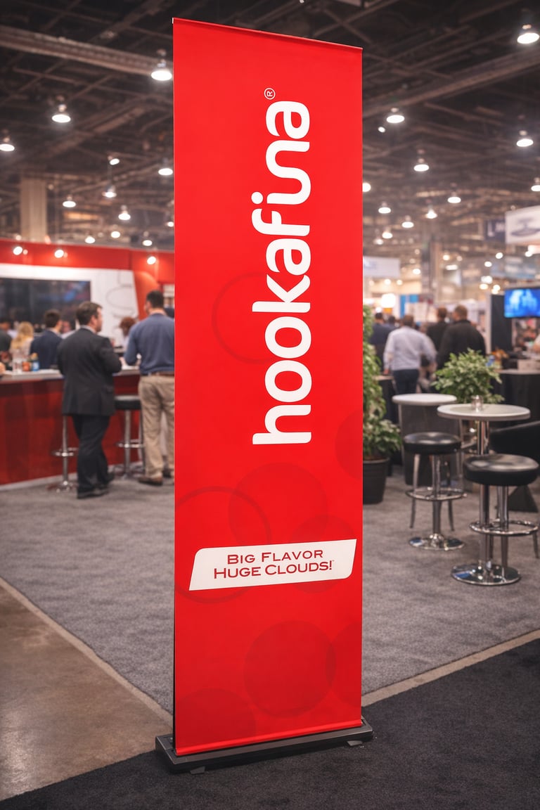
At trade shows and retail environments, the brand comes to life through striking fixtures and displays. Tall red banners, clean product racks, and organized flavor presentations create a cohesive visual experience that draws customers in from across the room. The bold red branding not only differentiates Hookafina from competitors but also communicates energy, flavor, and confidence.
By combining strong color psychology, modern packaging design, and impactful trade show displays, Hookafina established a brand presence that stands out in stores and exhibitions alike—turning every shelf and booth into a powerful statement of flavor, style, and innovation.